Monday, April 26, 2010

Froggy style

As some of you may have noticed, I'm currently working at Ossip Frolovs studio/shop in central Copenhagen. I'm completely in love with most of his designs, and find the frogs he uses in quite a few of them very fun:

I especially love it when he lets the frog hunt the crown the princess dropped in the well :


However, as he pointed out, he isn't the only one to use frogs. A quick Googling revealed an abundance of bejeweled frogs - many of them ranging from uninteresting to hideous. BUT a few do it well (some strange mixture of humor and quality) and amongst these is an old time favorite of mine: The German company Drachenfels (Dragon Cliff), who create sumptuous pieces with a silly twist. Just take a look at these very fairytalish quackers:

I still think I prefer Ossips version(s) though...
By the way: My favorite piece by Drachenfels is of cause with a dragon (I hope my boyfriend reads this ;-)

Will I be doing stuff with frogs? After having seen so many lovely specimens I don't think I can invent something truly my own - and I refuse to copy, so I think I'll leave the frogs to those who are so very competent and do something else like fairies. Nobody has ever done fairies before, right? ;-)

Saturday, April 24, 2010

Jewelry with humor - portable chuckles

Jewelry doesn't have to be so damn oh-look-at-hov-precious-my-bling-is serious. Noble materials are actually the coolest contrast to a portable wink-with-an eye and only the most daring do it. Here are some great examples that made me chuckle if not laugh out lound.

Here is Monika Krol with quite an istallation, making good use of your hands anatomy:


Fransizka Venrath combines dollafce with Mickey Mouse:


At Etsy, Auka sells custom made little beach sceneries. How about carrying around your own beach lion? This one is named Fabrizio:


And if you are into some serious bling plus Tim Burtons Alice in Wonderland, there is no way around this ring by H. Stern sporting a smiling cat in a tree - together with a (un)healthy dose of diamonds (the branches are encrusted in ice!). At dig this: The smile of the Chesire Cat has been treated to glow in the dark!:


I guess the real challenge is the combination of aestetics and humor - still have a bit to learn on that account me thinks, but it's gonna be fun doing so ;-)

Friday, April 23, 2010

Internship in a magic realm

Sometimes you are lucky. And sometimes you are VERY lucky.

I consider myself very lucky indeed!

Since monday I have been working at/with the jeweller Ossip Frolov in central Copenhagen. Ossip creates the most amazing jewelry - very fairytale and Lalique inspired - just like me! When I approached him some weeks ago to ask him if he would have me for a month he said "haven't I seen you before somewhere?" Well surely! He has seen me standing many times outside his windows gawking in and drooling! ;-) Ossip works mainly with silver, which he likes oxydized and coarse as a contrast to the warm gold and glittering precious stones. Look at pretties like these:


"Wooooow!" I have been sighing SO often while taking in his newest designs. See more here And now I'm so lucky that he wants to play with me. For now until the 15th of may. I even got my own vitrine to display my jewelry in and I have to say, it looks quite cool lined up like that:


Note the new ring in the middle featuring a large garnet and a number of small reddish sapphires


The tiaras look very nice hung like that - Ossips idea to let them float


The new line of earrings which I'm photographing and uploading on Etsy when I have time. I have created quite a few different ones and am having some of them covered with 24 carat gold.

Here is the guy himself: Ossip Frolov is from Russia and has been living here since his teens. He is very sweet, fun and talented and we enjoy it a lot to share ideas and techniques. How wonderfull that we both benefit from this sweet deal!


So, if you happen to be around Copenhagen, Møntnergade 22 close to the Rosenborg Castle, come in and say hi! I'll be sitting on the red stool working partly with Ossips designs, partly mine. And I will most likely be smiling as I do either!

Thursday, April 15, 2010

What to do with a large cabochon?

Some time ago I picked up this lovely cabochon – it was green with a number of nuances and sold by someone who didn’t have a clue as to what it was. My guess is moss agate but to be honest: I don’t know. What I do know is that I love the stone and so it was time to give it a nice setting.
Now, the obvious choice is to create a bezel setting on a sheet of silver and then perhaps add some adornments. A lot of very successful artists do that, amongst these Jamie from Bella Bijou Jewelry and Tess from Nova of Sweden. It’s a good choice because it sets the stone securely, allows for a lot of play and is still comfortable to wear. So I set out to play –my own style obviously ;-)
First a few drawings, realizing that I preferred the stone to be placed diagonally on the finger to allow for a more smooth and logical attachment of the decorations. I dug through a lot of stones and decided to go for contrast: orange and yellow sapphires. 
I created the bezel from fine silver (just easier to push over the stone when finished) and soldered it onto the sheet – and made a mistake when trying out the fit of the stone. TRICK: when doing that, place some dental floss under the stone in order to easily lift it out again! I didn’t and so my stone was stuck! It of cause meant that I had created a perfect bezel setting but still… So I went boldly ahead and drilled a hole in the back of the sheet, holding the whole thing in a small vice (with air below, enabling the stone to move away from the drill). Of cause I created a small spot on the stone! However, I decided to go ahead and create, what I had wanted to do from the beginning: and elaborate backside. By turning the stone around 180 degrees, I hid the small spot I had created with the drill. I love backsides, insides and hidden sides to be decorated – just for the owner to know and admire. It’s your own little portable secret. A little part of the pattern that I sawed out, I re-attached in a different spot, creating a bit of depth in the design.
Meanwhile I had decided against the contrasting colors. Staying within one general group of colors allows the wearer a bit more room when choosing outfit and accessories, so I went with green peridots and white sapphires instead. 
Then it was time for the inevitable curl (hey, it’s me! Read this article on the topic)  and start arranging the settings for the stones in order to solder them on. 
Eventually, I ditched the last tube setting, soldered it all together, sawed off the excess sheet, filed and sanded and added 3 golden balls for just a bit of warmth to contrast the cool green. Then I attached the ring shank and worked a bit off LOS into the small crevices that would become dark eventually in any case. Besides: it brings out the details a lot better! After even more buffing and polishing, I set the center stone and was ready to set the small ones
And here is the end result:

It’s big and of cause has a certain weight to it, but I don’t find it overwhelming. The tilted placement of the stone on the hand lightens the overall design. It’s gonna be hard to part with this baby!

Monday, April 12, 2010

What's that tiny country I live in like?

This one is for my foreign readers - though locals can of cuase apreciate it too:

I stumbeled uppon this interactive folder/site on Denmark and especially Copenhagen - my beloved city. I live in the part of the city called Nørrebro, described under "Go hood" - and it's an amzing combination of small-town coziness (Copenhagen only has apr. 1,5 million citizens and most of it has been build around 1900) and big-town cultural and colorfull  get-together.

Take a look and enjoy!

Saturday, April 10, 2010

Inspiration: There has to be a curl...

Jewelry can have infinitely many expressions: heavy, airy, detailed, simple, linear, curvy etc. Often a designer falls in love with a specific idiom and use jewelries as a media to explore its many nuances.

My idiom is the curl. By far the most of my pieces are equipped with a curl of some shape or form. A silly little non-necessity you might say, but to me it is this very design element that lends a special characteristic to my jewelry. And I'm by no means the first one – a whole style, the Art Nouveau, is closely linked with soft and flowing biomorph lines and curls.


As a genre Art Nouveau, especially the french version, is my biggest source of inspiration. The french jewelry and glass artist Renee Lalique for instance, created just before 1900 the most excellent and outstanding pieces within the genre and he is without a doubt my biggest idol. The period lasted only for a decade, then it became all a tad too much and the general taste took a necessary leap into Art Deco and swiftly after that minimalism.

However, ever since the style – or at least the curl – has resurfaced repeatedly. It seems to be natural to us – litterally. Studies have shown, that by far the most people prefer to look at pictures with soft shapes as opposed to edgy and linear shapes. Perhaps we feel safe in company of the soft and threatened when faced by the sharp? On the other hand, linear right-angeled-ness seems to provide us with a sense of comfort. With 90 degrees you know what you've got, whereas houses by Hundertwasser seem scarry to many. In other words: we like curls and curves when they adorn small items and prefer the solid elements of our lifes to consist of right angles.

But some rebel against it like the adult child Tim Burton. His movies are so quirky and allways populated with curls, as he unfolds his gothic stories to the gawping audience. Think Corpse Bride or the latest Alice in Wonderland and you'll know what I mean. We who love curls often also love Tim Burton – or at least part of his aestetic universe.


So, when buildings are too big to curl, then something tiny and controllable like a piece of jewelry is the perfect object to work with. A piece of jewelry is physically close to us. If it has been chosen wisely, it reflects  our personality – an outer picture of our own precious interior. The part that we hopefully cherish and are proud of. And many associate to the curl as something feminine and a romantic picture of our own uniqueness.

The curl and I have an intimate relationship. However, the curl is into adultery and so many others play with it. Here in Denmark, one of the most gifted jewelers is Minna from Milas www.milas.dk and she uses gold and diamonds along with other precious stones with great talent.


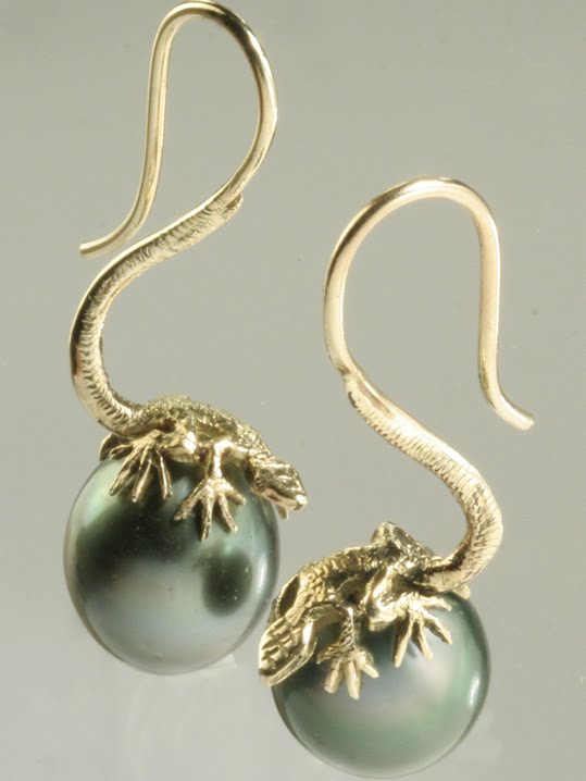
Examples of curls in my work you ask? Well, this bracelet is definitely curly:


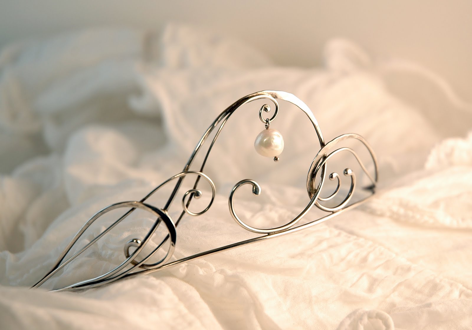
And when I go completely overboard, I create tiaras like this one:


Too much? I don't care. Curls are silly, lead nowhere and are absolutely impossible to be serious about – and that's why we love them!

Wednesday, April 7, 2010

So what did I use those rubies for?

I'm still thrilled about my rubies and as promised, I'll show you what I used one of them for:


Yes, a fantastic art nouveau inspired (well, most of my work is, but this one is fairly extreme I think) necklace, using one of the larger 1.7 carat oval rubies as a focal point. I added a smooth and slender onyx drop to finish off the piece elegantly and used black satin to match for the necklace itself.

I'm quite satisfied with this piece and hope to provide a good home for the other rubies as well...

See more picture (or buy it) here